其实毛玻璃的模糊效果技术上比较简单,只是用到了 css 滤镜(filter)中的 blur 属性。但是要做一个好的毛玻璃效果,需要注意很多细节。
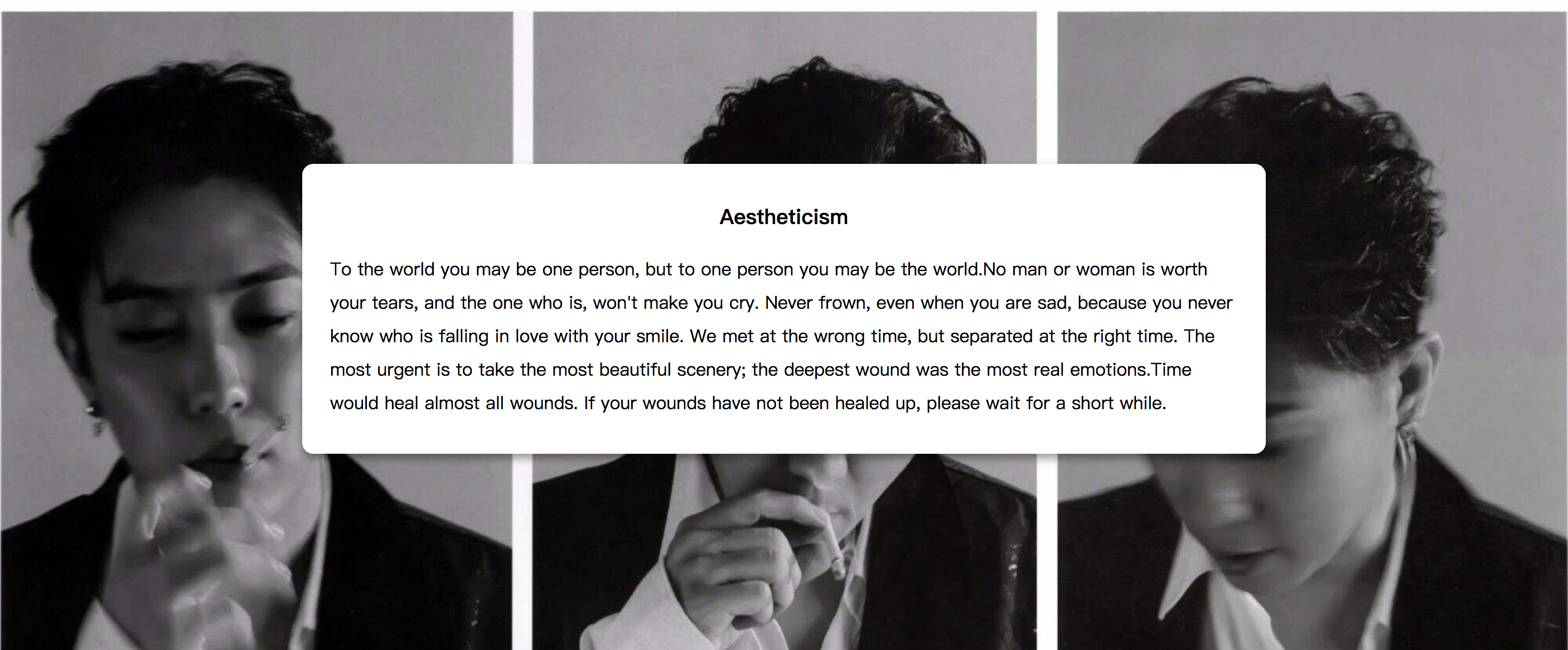
比如我们需要将上图中页面中间的文字区域变成毛玻璃效果,首先想到的是给其设置一个透明度,并添加模糊滤镜:
article {
background-color: rgba(0,0,0,0.3);
-webkit-filter: blur(2px);
-moz-filter: blur(2px);
-ms-filter: blur(2px);
-o-filter: blur(2px);
filter: blur(2px);
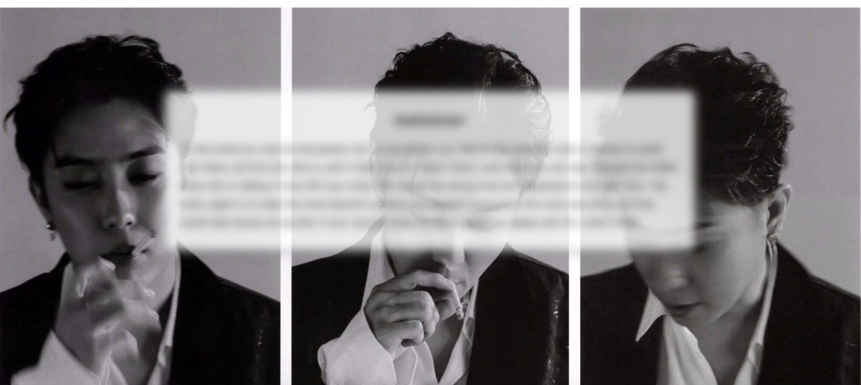
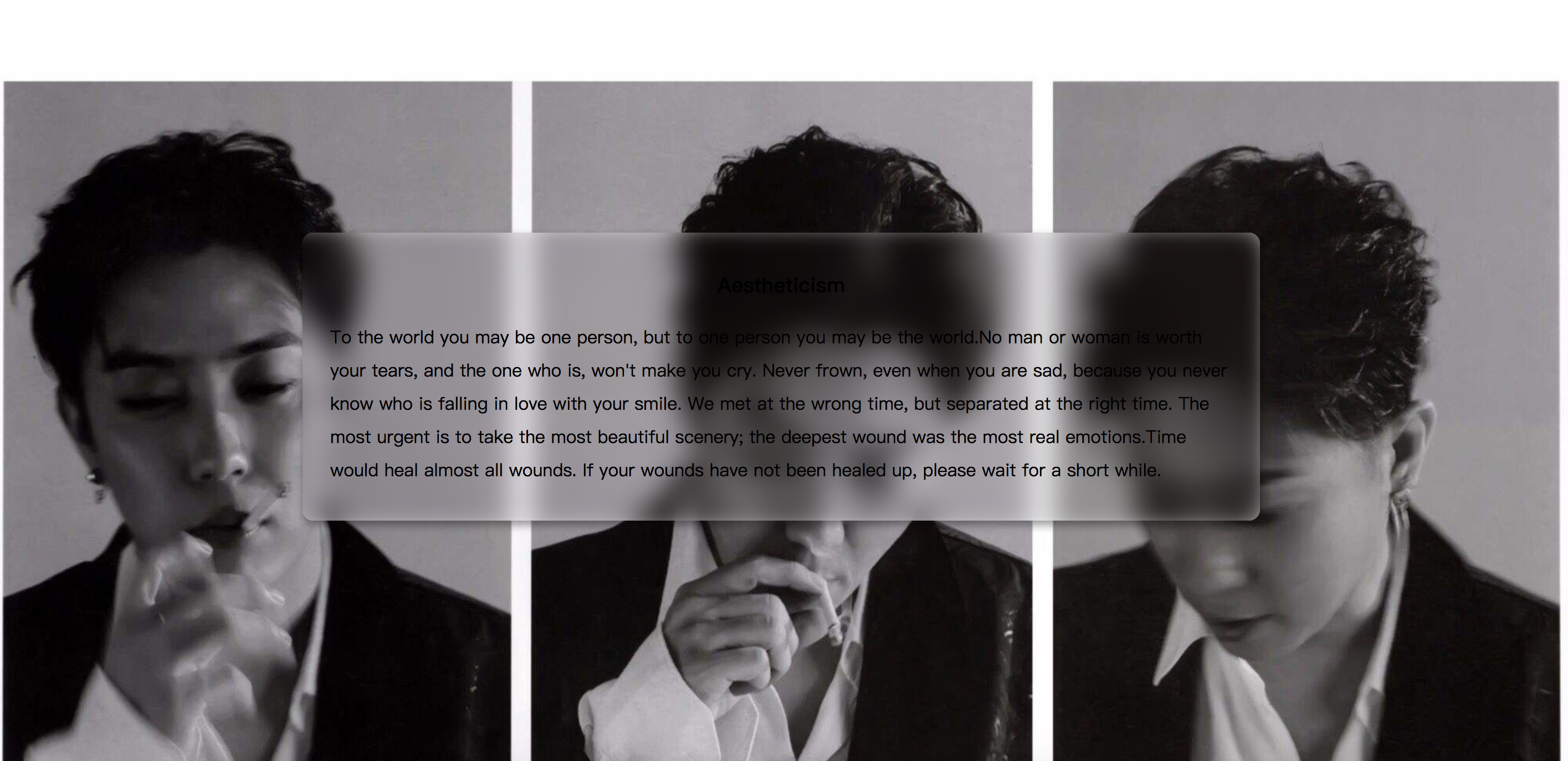
}可是生成的效果却是下面这样
 :
:
从这个失败的例子我们得到两个结论:
对元素直接使用模糊会将其内容全部模糊掉,为了保证文字不会模糊掉需要多一个层单独应用模糊效果。
模糊效果并不会应用到其背后的元素上,所以需要使用 content 区域有和背景相同的背景图并进行模糊。
先解决第一个问题:
多一个层级的方法不通过添加元素,而通过伪元素。
article {
    z-index: 1;
}


article :after {
        content: '';
        position: absolute;
        top: 0;
        left: 0;
        right: 0;
        bottom: 0;
        background-color: rgba(255,255,255,0.8);
        z-index: -1;
    }
这里有两点需要注意,由于伪元素不能通过 width:100% 和 height:100% 来继承宿主元素的尺寸,所以通过上述方式来继承 article 的尺寸;为了使伪元素位于 article 的下面这里给其设置 z-index:-1,为不使其隐藏到背景图的后面,这里给 article 设置 z-index:1;注意必须给article设置position:relative。
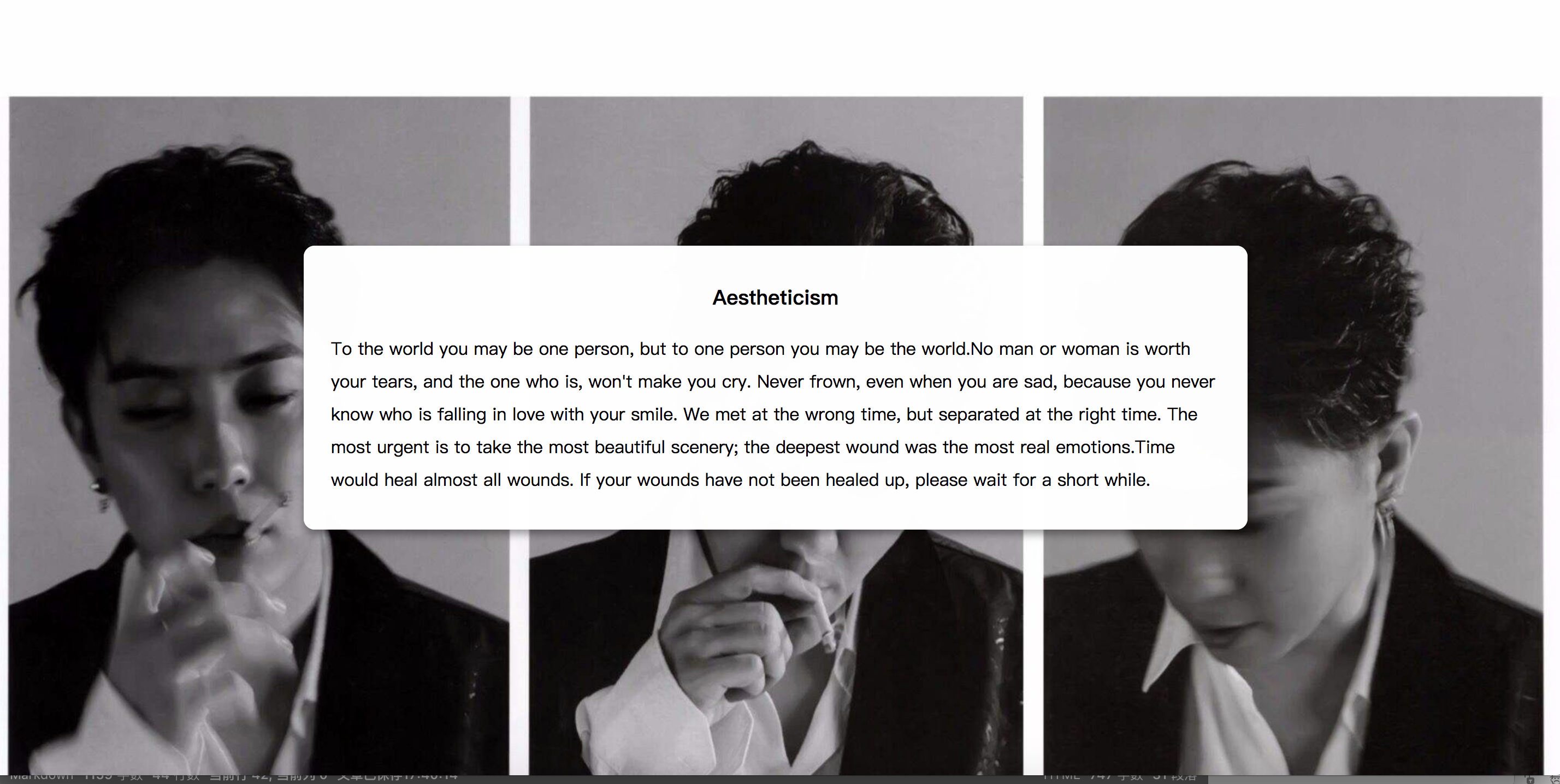
效果:
接下来给 article::after 设置相同的背景图。
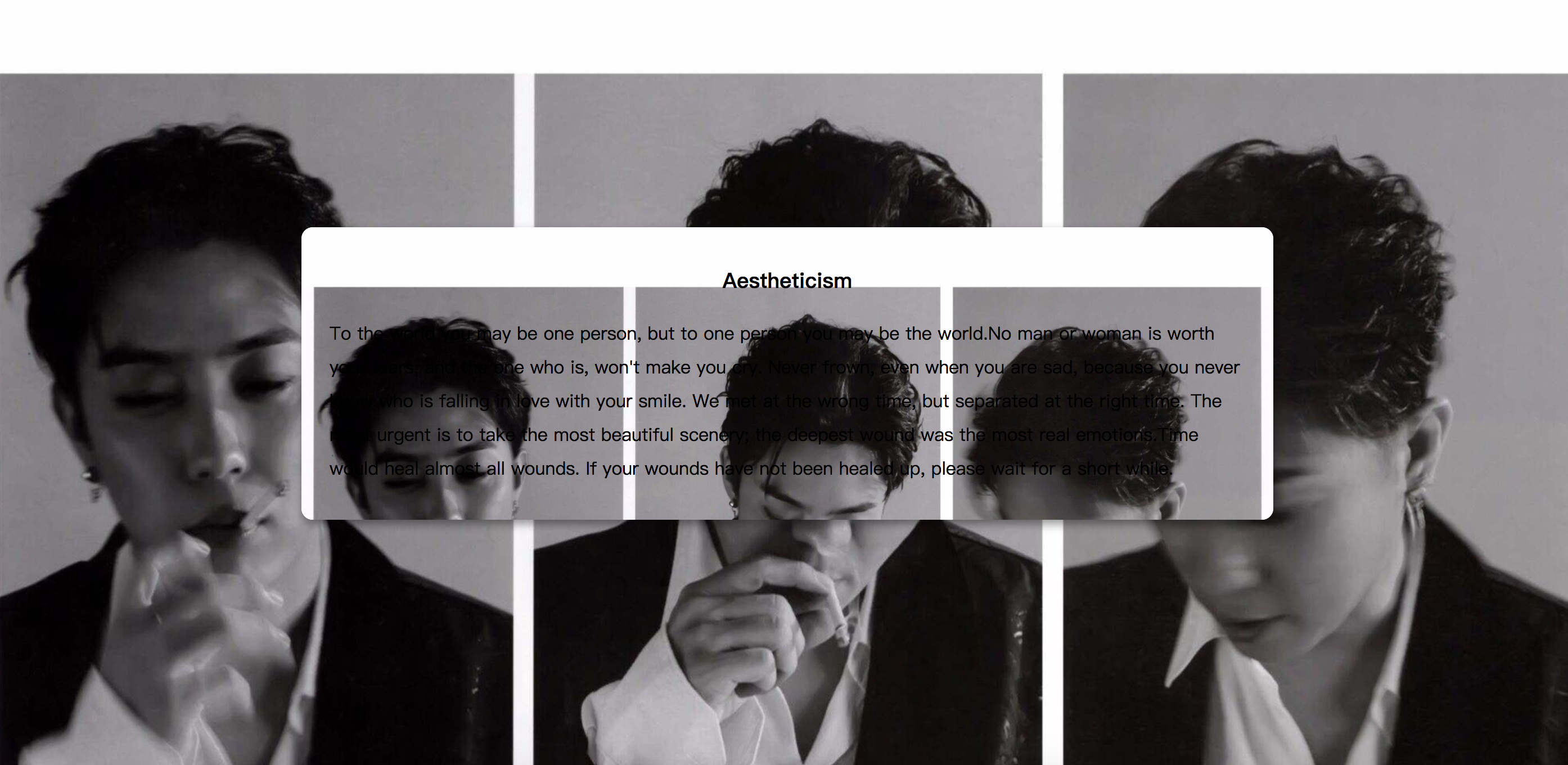
如上图,即使我们设置了相同的 background-postion 与 background-size,中间部分的图和大背景还是没有拼接成功。
解决这个问题的方法很简单,只需要添加 background-attachment: fixed 属性,之后为其进行模糊处理。
1 | article{ |
可以看到基本得到了我们想要的效果,美中不足的是在元素的边缘模糊的效果减弱了。为了解决这个问题,我们将伪元素的范围扩大一些,同时为了效果不超出 content 的范围,给其设置 overflow:hidden 属性。
article {
  overflow: hidden;
}
article::after {
  margin: -30px;
}
这样一个比较完美的毛玻璃效果就完成了,无论你如何改变浏览器窗口的尺寸,article 部分的背景图都能很好的与背景拼接,这都归功于 background-attachment 属性。
附上源码:
1 | <!DOCTYPE html> |